Thursday, December 15, 2016

Spectral Reflectance

INTRODUCTION

The following lab demonstrates the ability to measure and interpret spectral reflectance signatures of Earth surface features and materials and to perform basic monitoring of Earth resources using remote sensing band ratio techniques.  

METHODOLOGY

Spectral Signature Analysis

All spectral images were collected from a Landsat ETM+ aerial image of Eau Claire, WI. Using ERDAS Imagine, all spectral images were first digitized, organized by the signature editor, and analyzed using the signature mean plot. The first surface feature digitized was Lake Wissota to give a general overview of the process. The list of additional features collected were:
  • Standing water
  • Moving water
  • Riparian vegetation
  • Crops
  • Urban grass
  • Dry soil
  • Moist soil
  • Rock
  • Ashalt highway
  • Airport runway
  • Concrete surface

Resource Monitoring

To monitor vegetation health, the normalized difference vegetation index (NDVI) was used which subtracts the red band from NIR divided by the sum of the red band and NIR. The output image was then opened in ArcMap where the gradient was switched to an equal interval 5-class classisification system map. 

The same process was repeated to monitor soil health, except using the ferrous minerals equation (MIR/NIR) instead of the NDVI. 

RESULTS

Spectral Signature Analysis

Figure 1 shows the signature analysis process in ERDAS Imagine. The signature editor on the left displays all areas digitized while the mean plot on the right allows for analysis of the digitized feature.
Figure 1: Lake Wissota digitized with ERDAS signature editor and signature mean plot
Figure 2 shows the signature mean plot for moving water collected by Putnam Rock on the Chippewa River. Water features absorb most energy and have low spectral reflectance as the wavelength increases. The reason for higher reflectance in the blue band is because of the shorter wavelength and the resulting scattering. 
Figure 2: Signature mean plot for moving water in Eau Claire
Figure 3 shows the signature mean plot for a forested area in Eau Claire. Again the blue band has a higher reflectance in the visible light spectrum because of scattering. The reflectance peaks at the NIR band because the vegetation has absorbed all of the energy needed for photosynthesis in the visible spectrum and begins reflecting instead of absorbing.
Figure 3: Signature mean plot for forest area in Eau Claire
Figure 4 shows the signature mean plot for both dry and moist soils in Eau Claire. The largest difference in spectral reflection occur in the visible light spectrum. This is because of the moisture content in the moist soil. At the NIR wavelength, however, the water no longer has the same effect and when analyzing soil health, it's essential to collect data in the first three bands to provide easy identification.
Figure 4: Signature mean plot for dry and moist soils in Eau Claire
Figure 5 shows the signature mean plot for all collected features while Figure 6 shows these features listed in the editor.
Figure 5: Signature mean plot for all features collected in Eau Claire
Figure 6: Signature editor displaying all features collected in Eau Claire
Crops, dry soil, and airport all show similar trends of dipping reflectance on band 4, increasing to band 5 and then decreasing again on band 6.
Forest, urban grass, and moist soil all show similar trends of slowly decreasing from band 1 to band 3, followed by an increase on band 4 and a decreasing reflectance to band 6. All of these have moisture in them that reflects energy similar.
Concrete surface, standing water, and moving water all show a similar trend of slowly decreasing reflectance from band 1 to band 6. This could be because they all have very little reflectance throughout all wavelengths.
Asphalt and rock are very similar in that the reflectance is maintained from band 1 to band 4 and then peaks a little at band 5. This could be because
Concrete has a unique spectral signature. This is because of its unique composition of material.

Resource Monitoring

As shown by Figure 7, the spectral reflectance of the NDVI was re-classified in ArcMap to produce a map showing vegetation health in Eau Claire. This is a cheap and efficient way of vegetation monitoring and can be used for a vast number of purposes. The white in the image indicates an abundance of forest, while the black indicates areas that vegetation doesn't exist. 
Figure 7: Map showing vegetation health in Eau Claire
Figure 8 then shows the same thing but instead for soil monitoring. The white in the image indicates where most ferrous minerals are located and indicate man-made structures that consist of concrete, asphalt, and other materials.
Figure 8: Map showing soil health in Eau Claire

SOURCES

Satellite imagery is from Earth Resources Observation and Science Center, United States Geological Survey

Friday, December 9, 2016

Stereoscopy, Orthorectification, & Calculations

INTRODUCTION

The following lab demonstrates knowledge in stereoscopy and performing orthorectification. Key photogrammetric tasks were performed on aerial photographs and satellite imagery to understand calculations of photographic scales, measurements of areas and perimeters, and calculating relief displacement. First, measurements were made from aerial imagery to calculate scales, areas, and relief displacement. Next, anaglyph imagery was created using a digital elevation model (DEM) and a digital surface model (DSM). Finally, orthorectification was performed to produce a planimetrically true orthoimage using ground control points (GCPs).

METHODOLOGY

Calculations from Aerial Imagery

Scales

To calculate scale from a nearly vertical image, focal length is divided by the flying height of the aircraft. Flying height is calculated from the altitude above sea level (ASL) of the exposure station minus the elevation of terrain.

Areas

To calculate measurement of area on aerial imagery, the area is digitized using a measurement tool which gives you an output of desired units. 

Relief Displacement

To calculate relief displacement, the height of a tall object is measured and converted into a distance using the aerial image's scale. This value is then multiplied by the distance from that object to the principal point of the object. This product is then divided by the height of the camera above the local datum of that image. 

Stereoscopy

To correct for relief displacement and better view height and changes in elevation, anaglyph imagery is created for a 3D effect. Original imagery of Eau Claire with relief displacement was combined with a digital elevation model at a 10-meter spatial resolution. Next, the same function was performed with a LiDar-collected, 2-meter spatial resolution digital surface model. 

Orthorectification

To correct for spatial anomalies, orthorectification was performed on two aerial photos to produce a seamless transition between the two. Both images were uploaded to IMAGINE Photogrammetry Project Manager. The point measurement tool was then activated to collect ground control points between each image and a separate reference image without spatial anomalies. When matching GCPs, the coordinates between images were within 10 meters of each other to maintain accurate corrections. After matching three GCPs, the automatic drive was selected allowing the program to estimate matching GCPs on the reference image.

After 12 GCPs were collected for both images based on the reference image, automatic tie point collection was performed to match GCPs collected from both input images. Triangulation was then performed to match the tie points collected in the overlapped area of the two images. Finally, ortho resampling was performed to correct the original spatial anomalies of both images. 

RESULTS

Calculations from Aerial Imagery

Scales

If the distance between two points were measured by an engineer's chain to be 8,822.47 ft and according to aerial imagery, the distance measured 7 inches, the scale of the image would equal 1:38,498.
If an aircraft took aerial photography at 20,000 ft. ASL of Eau Claire with a 796 ft. ASL elevation, with a focal lenth of 152mm., the scale of the photograph would equal 1:38,509.

Areas

Imagery from ERDAS was carefully digitized and automatically given an outputted area measurement according to the polygon drawn. 

Relief Displacement

The height of the smokestack in the image measured 0.5 in., which coverts to 133.71 ft., using a scale of 1:3,209. The 133-foot smokestack was then multiplied by the distance to the principal point of the image (10.5) and divided by the height of the camera above the local datum of the image (3, 980). As a result, the calculated relief displacement of the image is 0.35 away. 

Stereoscopy

The original Eau Claire aerial image shows clear relief displacement that shows distortion within the image. This can be observed in Figure 1 by the tall buildings of Towers North, a tall campus building located in Eau Claire.
A stereoscopic view of Eau Claire was then produced using a 10-meter spatial resolution digital elevation model which gives an enhanced view of depth and elevation using three dimensions. This is illustrated in Figure 2 and 3. However, polaroid glasses are needed to view the imagery in 3 dimensions.
Figure 2: Input photos of relief displacement and 10-meter DSM
Figure 3: Output stereoscopic image from Figure 2 input images
The same process was repeated, but instead a LiDar-collected DSM at 2-meter spatial resolution was used for the anaglyph image. The results showed a much more in-depth representation of elevation change and height of surface features. 
Figure 4: Enhanced anaglyph photo using LiDar-collected DSM

Orthorectification

While collecting matching GCPs between both input images and the spatially-accurate reference image, all coordinates were within 10 meters to preserve an accurate orthorectification as shown by Figure 5.
Figure 5: Collecting GCPs from input image to a spatially-correct reference image
After collecting all GCPs for both input images, a summary is shown in Figure 6 of the automated tie points generated in the Photogrammetry Project Manager.
Figure 6: Automatic tie point collection between both images and the reference image
The resulting tie points for each input image is shown in totality by Figure 7.
Figure 7: All tie points gathered between the two input images
Figure 8 then shows an overview of both images after performing triangulation calculated based on the tie points generated.
Figure 8: Triangulation from tie point collection
Finally, Figure 9 shows the orthorectified image after being resampled. Both inputted images now have all spatial anomalies orthorectified to produce a seamless transition and accurate spatial data.
Figure 9: Spatially-accurate orthorectified output imagery

SOURCES

National Agriculture Imagery Promgram (NAIP) images are from United States Department of Agriculture, 2005.
Digital Elevation Model (DEM) for Eau Claire, WI is from United States Department of Agriculture Natural Resources Conservation Service, 2010.
Lidar-derived surface model (DSM) for sections of Eau Claire and Cheippewa are from Eau Claire County and Chippewa County governments respectively.
Spot satellite images are from Erdas Imagine, 2009.
Digital elevation model (DEM) for Palm Spring, CA is from Erdas Imagine, 2009.
National Aerial Photography Program (NAPP) 2 meter images are from Erdas Imagine, 2009.

Monday, November 21, 2016

LAB 6: Geometric Correction

INTRODUCTION

The following lab demonstrates the ability to perform geometric correction. This is an important activity used in satellite image preprocessing before interpreting and extracting data. Both a 1st order and a 3rd order polynomial transformation was performed. 

METHODOLOGY

For the first order polynomial transformation, a Landsat TM image of the Chicago metropolitan Area was corrected using a USGS digital raster graphic of the same area. Using ERDAS Imagine, both images were displayed side-by-side in 2d-viewers. The process began by selecting a polynomial geometric model from control points. The input image was the Landsat TM and the reference image used was the USGS image. Four ground control points were then placed in the same location on both images, all spread away from each other to produce an accurate geometric correction for areas on the imagery. A careful examination of spatial accuracy of matching GCPs was made by maintaining a root mean square (RMS) error of less than 0.05 and a control point error total of less than 0.5.

For the third order polynomial transformation, a corrected Landsat TM image of the Eastern Sierra Leone region was used to correct satellite imagery of the same region. The same process was executed, except a third-order polynomial transformation was performed. A total of 12 GCPs were matched and the RMS error and total control point error was maintained at less than 1.

RESULTS

Figure 1 shows the matching four ground control points located at nearly the same exact location in both the input and reference image. This is only a first-order polynomial transformation, so only three matching GCPs are required. 
Figure 1
Figure 2 shows the same view as figure 1 except for the Eastern Sierra Leone region. Since a third-order polynomial transformation is performed, a total of 10 GCPs is required.
Figure 2
Figure 3 shows the geometrically-corrected image over the pre-existing Landsat TM imagery. The grayer image is the output image and the correction can be seen by the curving of the left side of the image and the abrupt change on the right edge where the cutoff point is between images. 
Figure 3


SOURCES

Satellite images were obtained from Earth Resources Observation and Science Center, United Sates Geological Survey.
Digital raster graphic was obtained from Illinois Geospatial Data Clearing House.

Thursday, November 10, 2016

Lab 5

INTRODUCTION

The following lab demonstrates knowledge in basic LiDAR data structure and processing using ERDAS Imagine and ArcGIS. Specifically, it demonstrates the ability to process and retrieve digital surface models (DSMs) and digital terrain models (DTMs), and processing and creation of imagery from the point cloud. The scenario is to envision being a GIS manager working to check LiDAR point cloud data and verify classification in Eau Claire County, WI. After verifying and correcting point cloud data, a DSM, a DTM, and an intensity image was produced.

METHODOLOGY

Creating an LAS Dataset

Using ArcMap, a new LAS Dataset was made and all LAS files, showing points in tiles, were added. Calculating statistics for the dataset gave information to determine quality assurance and quality control of individual files and the overall dataset. Comparing the Min Z and Max Z with known elevation of the AOI gives this answer.
Next, to assign the correct coordinate system to the LAS dataset, the metadata from the original point cloud data obtained from Eau Claire County, 2013 was analyzed and assigned accordingly to the XY and Z projected coordinate systems. The dataset was then added to ArcMap with a shapefile of Eau Claire County obtained from Price, 2016 to ensure spatial accuracy. A reclassification from 9 to 8 classes allowed for better representation of elevation.
The aspect, slope, and contour of the AOI can then be examined and be used to provide supporting data to improve classification within an Expert System classifier.

Visualization as Point Cloud

To further analyze any given feature of the AOI, a profile can be derived using the LAS Dataset Profile View tool. Instead of showing an aerial image of the first return echoes of LiDAR, this allows for a 3D profile image containing multiple return echoes to determine a feature's actual shape.

Generating DSMs and DTMs from Point Clouds

For better visualization of the AOI, a DSM and DTM each enhanced by hillshade was generated. To determine the spatial resolution for these derivative products, the average nominal pulse spacing (NPS) was obtained from the dataset properties. The dataset was then set to points coded by elevation and filtered by first returns.
Using the Arc Toolbox to generate a DSM, the LAS dataset was converted to a raster. Binning interpolation type with a maximum cell assignment and natural neighbor void fill method was used. The sampling type was set to approximately 2 meters. To enhance this DSM, a hillshade was applied, narrowing the grayscale of the imagery to just the shades of objects. This was done using the hillshade function in the 3D analyst tools.
To obtain a conversion from LAS dataset to a DTM, the dataset was left on points coded by elevation, but instead filtered by ground. The same conversion was performed with the same parameters except for a minimum cell assignment. A hillshade of the DTM was performed with the exact methodology of the DSM.
For the final derivative, a LiDAR intensity image was produced by setting the LAS dataset to points and a first return set on the filter. For the LAS dataset conversion to raster, the same parameters were used as the DTM except the value field switched to intensity and call assignment type to average. Autocorrections to brightness were made switching the image from ArcMap to ERDAS Imagine.

RESULTS

Creating an LAS Dataset

Figure 1 shows Eau Claire point cloud data according to aspect. The different shades delineate specific parts and features of the aerial photography.
Figure 1: Aspect view
Figure 2 shows Eau claire point cloud data according to slope. Red indicates the most dramatic change in slope, while green is the neutral, flat slope area.

Figure 2: Slope view
Figure 3 shows Eau Claire point cloud data according to contour. The deep red color is used to indicate the outlines of specific objects and changes in elevation.

Figure 3: Contour view

Visualization as Point Cloud

Figure 4 shows an Eau Claire walking bridge as orange points in a linear fashion crossing the white Eau Claire River as detailed by LiDAR. This is a 2D view of first-return echoes captured by the LiDAR sensor.
Figure 4: 2D bridge view
Using a profile view, the shape of the actual walking bridge is obtained by showing multiple return echoes captured by LiDAR, thus giving a better interpretation of the actual shape of a feature.

Figure 5: 3D bridge view

Generating DSMs and DTMs from Point Clouds

The average NPS for Eau Claire was 1.55 meters which gave the 2m spatial resolution used for Figures 6-10. The digital surface model in Figure 6 is a raster showing elevation collected at the first return by LiDAR. This imagery can be used as supporting data for classification of forest and buildings and other structures above ground surface. 
Figure 6: DSM of Eau Claire County
The hillshade function as shown by Figure 7 narrows the gradient, providing the grayscale to only include shades of objects in Eau Claire. 
Figure 7: Enhanced DSM using hillshade technique
The DTM of Eau Claire shown in Figure 8 represents the bare-Earth terrain and excludes first return echoes for ground return echoes collected by LiDAR. 

Figure 8: DTM of Eau Claire County
Just as Figure 7 did for the DSM, the hillshade again narrows the gradient to show only shades of the elevation in the terrain, providing much more useful imagery for the DTM as shown by Figure 9.

Figure 9: Enhanced DTM using hillshade technique

For Figure 10, a LiDAR intensity map was derived from original point cloud data and transferred from ArcMap to ERDAS to adjust brightness for better aerial interpretation.

Figure 10: LiDAR Intensity of Eau Claire County 


SOURCES

LiDAR point cloud and Tile Index drawn from Eau Claire County, 2013.

Eau Claire County shapefile was from Price, M. H. (2012). Mastering ArcGIS. Dubuque, IA: McGraw-Hill. 


Wednesday, November 2, 2016

LAB 4

INTRODUCTION

The following lab demonstrates the ability to delineate from large satellite imagery and syncing satellite imagery with Google Earth. It also showcases optimization of spatial resolution and radiometric enhancement used for better interpretation. Lastly, the lab demonstrates resampling, image mosaicking, and binary change detection techniques. All techniques used and skills demonstrated were done so using satellite imagery over Eau Claire, WI. The lab is divided into seven parts: Image Subsetting, Image Fusion, Radiometric Enhancement, Synchronizing Google Earth, Resampling, Image Mosaicking, and Binary Change Detection.

METHODOLOGY

IMAGE SUBSETTING

To create a smaller study area (Eau Claire/Chippewa Falls) from a large satellite image (Eau Claire and surrounding counties), an inquire box was drawn and a subset and chip function was performed. Next, to subset an image that is non-rectangular, a delineation of an area of interest (AOI) was executed. A shapefile of the AOI was uploaded over the original satellite image, delineated using the paste from selected object function, and saved as an AOI layer. Again, a subset & chip function was performed.

IMAGE FUSION

To optimize spatial resolution for visual interpretation purposes, a course resolution image was combined with a panchromatic image with a higher spatial resolution. This image fusion retained the reflective image while improving spatial resolution to that of the panchromatic image. This was done by using a resolution merge function in the Pan Sharpen icon under the Raster tab with a multiplicative method and nearest neighbor resampling technique.

RADIOMETRIC ENHANCEMENT

To enhance spectral and radiometric quality for image analysis, a simple haze reduction function was performed. This was done by going to the Raster tab, and finding the haze reduction function under the Radiometric icon. Default parameters were used.

SYNCHRONIZING GOOGLE EARTH

To provide additional information and a current satellite image to aid in image classification, Google Earth was linked to the image viewer in ERDAS. This was done by navigating to the Google Earth tab and connecting and syncing to view. 

RESAMPLING

To increase spatial resolution of an image for enhanced clarity and accuracy, resampling up is performed to reduce the size of pixels and increase file size. Two resampling functions were used--one using the nearest neighbor technique and for the other, bi-linear interpolation. Both techniques used the resample pixel size in the Spatial icon under the Raster tab. Pixel size for each was resampled up from 30x30m to 15x15m. The only difference between techniques was choosing nearest neighbor or bi-linear interpolation methods. 

IMAGE MOSAICKING

When the AOI is greater than the spatial extent of a single satellite image scene, an image mosaicking is performed to combine multiple satellite images to fully extend over the AOI. Image mosaicking was performed twice, first using Mosiac Express and then Mosiac Pro. Both were found in the Mosaic icon under the Raster tab. For Mosiac Express, the multiple images in virtual mosaic icon was selected under the Multiple tab and background transparent and fit to frame was selected under the Raster Options tab. After the two images were uploaded, all default options were used. For Mosaic Pro, after uploading both images, the use histogram matching option was selected in the Color Corrections icon and the overlap areas was used for the matching method shown in the Set icon. 

BINARY CHANGE DETECTION

To estimate and map the BVs of pixels that changed in Eau Claire County and neighboring counties, binary change detection was performed. The Two Image Functions was selected from the Functions icon under the Raster tab. Only layer 4 of the two images were analyzed to detect change for simplification. Under the output options section, the Operator was switched to negative. After this function was performed the resulting image's histogram was analyzed to predict the threshold where the areas of change would occur.
In order to map the resulting image, a model was made in Model Maker under the Toolbox tab. Two rasters were created of both images which led to a function and an output raster. The function used was raster 2 subtracted from raster 1 adding the constant of 127 to avoid getting negative BVs.
This constant shifted the histogram positively and sent the change threshold to the upper tail of the histogram. Another calculation was made using 3 standard deviations added to the mean to find a new threshold. Using the current image as a raster, a new model was produced where a conditional function was performed giving a value of 0 to all values under this threshold and a value of 1 for all values above.
The resulting image was then transferred to ArcMap and overlaid by another image of the surrounding area. All areas shown from the ERDAS image produced from the model maker represent BVs that changed from our original images.

RESULTS

IMAGE SUBSETTING

Figure 1 is a subsetted image of Chippewa Falls/Eau Claire area from the original Eau Claire and surrounding county satellite image. This subsetted image is limited to a square area.
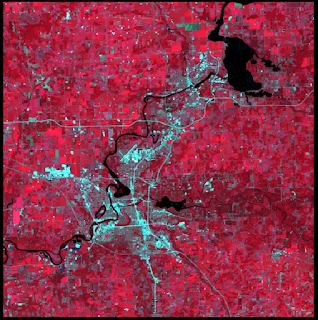
Figure 1
Figure 2 is also a subsetted image of the Chippewa Falls/Eau Claire area from the original Eau Claire and surrounding county satellite image. However, the AOI (area of interest) was delineated by a previously-made shapefile--this method allows for non-rectangular AOIs to be examined.
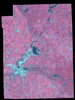
Figure 2
Both the inquire box and AOI methods can be used to subset a larger satellite image and have their advantages. Although the inquire box method might be faster and adequate for less-intensive work, the AOI method allows for specific delineation and takes more effort to create a shapefile to subset.

IMAGE FUSION

The subsetted image from Figure 2 was used. However, the 30x30m spatial resolution needed to be upgraded to a 15x15m resolution. The reflective image was fused with a 15x15m panchromatic image to retain the reflective properties of Figure 2's image but increase the spatial resolution to that of the panchromatic image. Results can be seen by Figure 3 and compared to that of Figure 2.
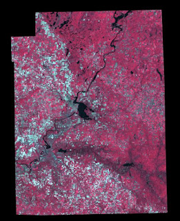
Figure 3

RADIOMETRIC ENHANCEMENT

Figure 4 shows satellite imagery of the Eau Claire County area after a haze reduction function has been performed. In the original satellite imagery collected, a white haze was collected congregating around the lower right portion of the image. After the basic haze reduction, all that is shown is a slight shadow where the originally corrupted data was recorded. 
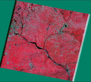
Figure 4

SYNCHRONIZING GOOGLE EARTH

After connecting, linking, and synchronizing Google Earth to Erdas, the screencapture of Figure 5 shows the supplementary information that can be gathered such as labels attached to cities, rivers, and features and a plethora of pictures taken in the area. 
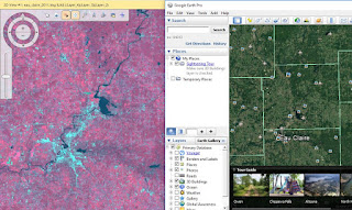
Figure 5

RESAMPLING

After resampling up the Chippewa Falls/Eau Claire area from 30x30m to 15x15m, the results are shown when zoomed in with the left window representing the nearest neighbor method and the right representing the bi-linear interpolation method. 
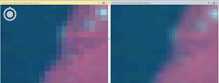
Figure 6

When resampling up, the new pixels created by reducing pixel size need new brightness values (BVs). Using the nearest neighbor method, these new pixels are assigned BVs by taking the BV from the nearest pixel. This is advantageous because it doesn't take much computer processing power and is fairly quick. However, when observed closely there is a stair-stepping effect along boundary lines. In this case the Eau Claire River is seen as a blurrier, less-defined boundary from land. When observing the right window which used bi-linear interpolation, the resulting image has a smoother, more-defined boundary between the river and land. This is because using the bi-linear interpolation method, the new pixels are assigned a new BV using an average of all its neighboring pixels. This provides a more seamless transition from boundaries where there is a great BV difference in pixels.

IMAGE MOSAICKING

For Figure 7, the mosaic performed using Mosiac Express is shown as the top image and the Mosiac Pro image is shown on bottom. Using Mosiac Express, the pixels in the overlapped area between images simply use the BVs from the top image. This retains data from the original histogram, but provides a very abrupt transition from the top and bottom images and won't match values to the bottom image's histogram. 
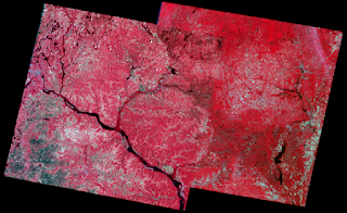
Figure 7

As shown by the bottom image, the mosaic using Mosaic Pro offers a much smoother transition of BVs between the two images. This takes more computer processing and therefore takes longer. However the results are much better because the pixels of the overlapped area are averaged out between the histograms of the two images and new BVs are assigned to the overlapping pixels using this information.

BINARY CHANGE DETECTION

After running the image differencing fuction, the resulting image's histogram is shown by Figure 8. A calculation of 1.5 standard deviations added to the mean of the BVs was performed and gave a predicted positive (70.08) and negative (-24.26) threshold for pixel change in BV on the histogram. 
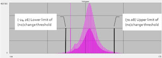
Figure 8
Figure 8 shows the ERDAS image after the first function to subtract the 2nd raster from the 1st was run and the second function to adjust for only values that were above the threshold of change or no change was also run.

This image was overlaid upon another image of the same area in ArcMap where all red values represent change from one raster to the other.

SOURCES

Data was obtained from the drive at the University of Wisconsin-Eau Claire at Q/StudentCoursework/Wilson/GEOG338-001/Lab4
Satellite imagery was obtained  from Earth Resources Observation and Science Center, United States Geological Survey.
The shapefile used for image subsetting was obtained from Mastering ArcGIS 6th edition Dataset by Maribeth Price, McGraw Hill, 2014.